Button grouping on graphical user interfaces
This article describes how button grouping affects button state changes on Biamp Control graphical user interfaces (GUIs) such as those displayed on Biamp Touch Panels.
Sources and power example
Automated button state changes are built into each Biamp Control system. As an example, when source sequences are added to buttons, only one button state can be active at a time. When pressed by a user, the selected source changes to button state 2 and the other buttons with sources from the same device fall back to state 1.
Power: Similarly, when a system is in an OFF state, none of the sources are active. However, the OFF button will be in state 2, indicating to users the system is turned OFF.
Button grouping example
The previous state change example works in a system with a single display or projector. However, for a system with two projectors, button states will not display correctly since only one active source at allowed at a time, the two projectors, The commands are still sent in this scenario, but the button states are now incorrectly represented. Use of the Button Group function is required to keep state change automation in systems with two or more displays or projectors in a project. Otherwise, all state changes must be set manually.
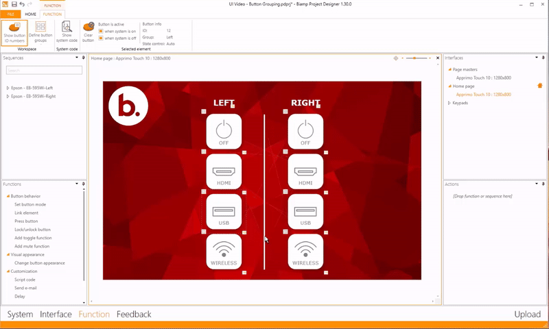
An example grouping process
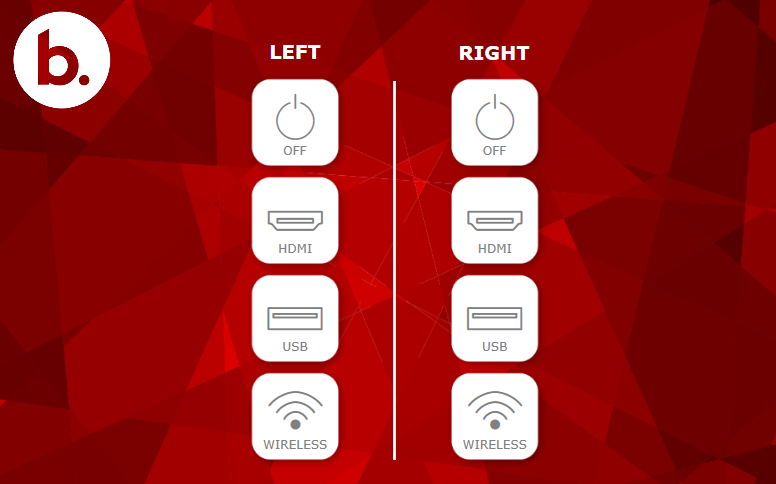
- Start by creating an interface layout in Biamp Project Designer. The example below shows a left and a right projector in a project.
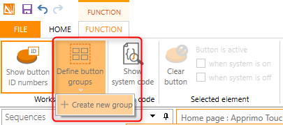
- After creating the interface layout, add the button groups using the Functions tab in the top ribbon. Click on the "Define button groups" under the tab and then "Create new group".
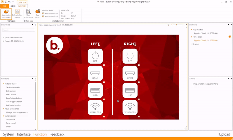
- For this example, create a group and name it "Left" in the Group Name field.
- Then select the buttons (Sources and OFF) for the left group. These are marked with orange squares in the example animation below.
The selected buttons now act as one enclosed group of buttons. Their behavior is independent of other groups.
- Repeat the steps to create the Right group in this example project.
- Sequences: Now add the sources and power off sequences to the buttons using the Sequences pane on the left side of the screen.
- Workflow note: It does not matter if you create the groups first or add the sequences first.
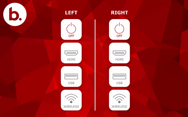
Operational example
The animation below shows how the grouped buttons from the process example operate after being uploaded to a touch display controller. Specifically, the left- and right-side groups operate independently of one another as intended. Each side can only have one active button, but no effects are seen on the other side thanks to the split the user interface created using the two button groupings.
Summary and keypad applications
To recap, Button grouping is an easy way of keeping automation in design cases where you would otherwise need to manually create all button state changes using the "Change button appearance" function.
This method also works on keypad controllers. To do so, create groups on a keypad or across multiple connected keypads.
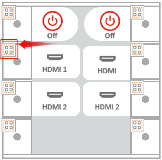
Buttons that are part of a group are indicated by the square symbol with four boxes stipulated.